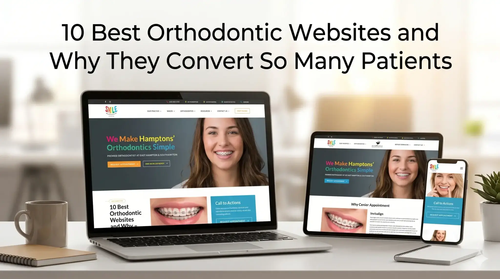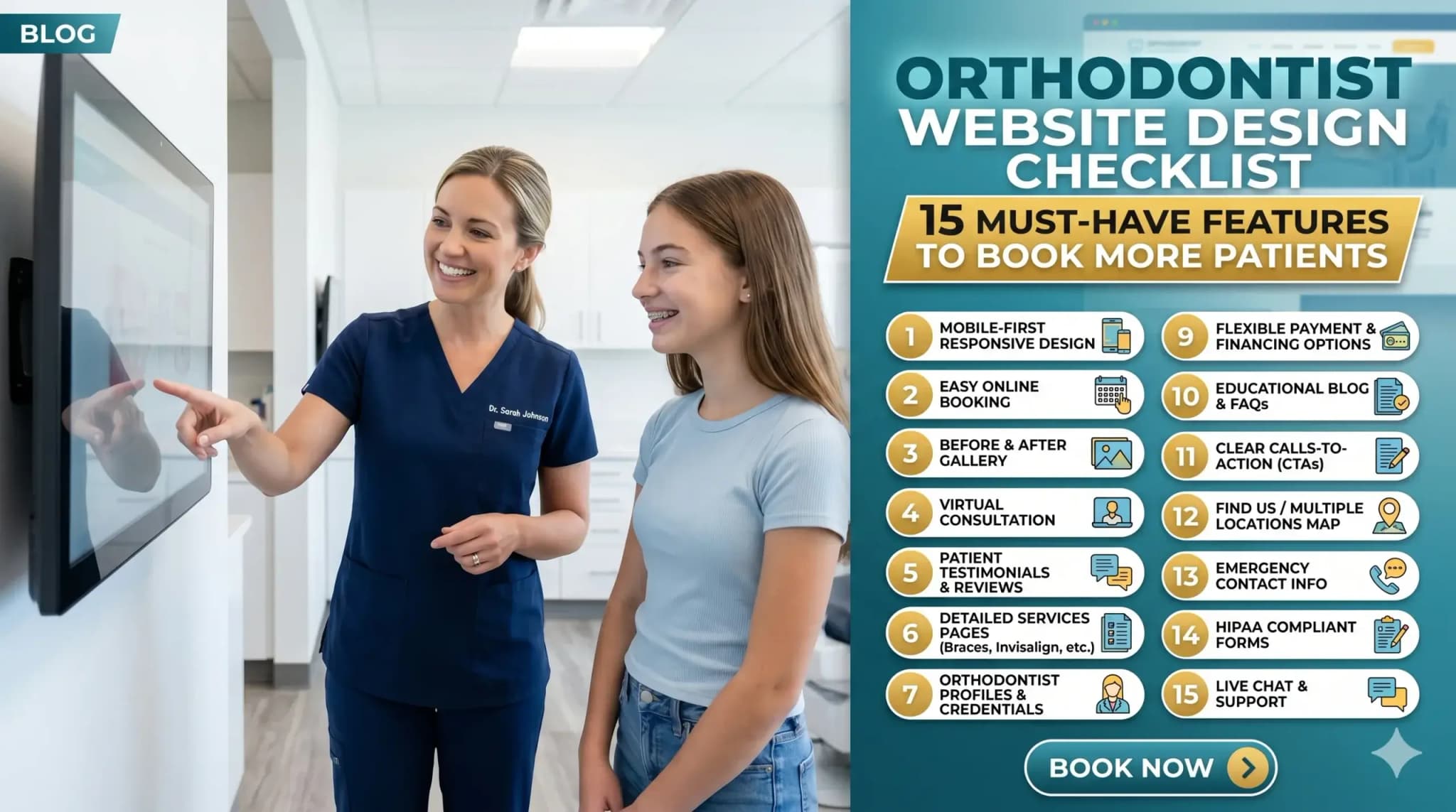
Orthodontist Website Design Checklist: 15 Must-Have Features to Book More Patients
You spent real money on a website. Maybe a few thousand dollars, maybe more. It looks clean, it has your logo, your services are listed — and yet your phone still isn’t ringing the way it should.
Most orthodontists assume the problem is awareness. “Not enough people know about us yet.” But the reality is harsher: people are finding your website — and leaving without calling.
The problem isn’t your marketing budget. It’s what happens the moment a potential patient lands on your site. Most orthodontic websites are built to look professional, not to perform. There’s a significant difference between the two.
This checklist breaks down the 15 features that separate a website that books patients on autopilot from one that just sits there. Work through it honestly. By the end, you’ll know exactly what your site is missing — and what it’s costing you.
1. Your Site Loads in Under 3 Seconds
Think of your website like a front desk receptionist. If a patient walks in and stands there for 5, 6, 7 seconds without anyone acknowledging them — they leave. A slow website does the same thing.
Most people won’t wait. Studies consistently show the majority of users abandon a site that takes longer than 3 seconds to load. On mobile, that window is even shorter.
The technical cause is usually oversized images, outdated hosting, or code-heavy page builders. But the business cost is simple: you’re losing patients before they even see your phone number.
At Digital Trace, every site we build is optimized for speed from the ground up — not patched after the fact.
2. Mobile-First Design (Because That’s Where Your Patients Are)
Over 60% of local searches happen on a phone. If your orthodontic site was designed on a desktop and “made responsive” as an afterthought, patients on mobile are seeing a broken, cramped version of what you intended.
Buttons that are too small to tap. Text that requires zooming. A “Book Appointment” button buried below the fold.
A mobile-first design means the phone experience is built first, with desktop as the secondary view — not the other way around. This is one of the single biggest gaps we see in orthodontic clinic website design.
3. A Click-to-Call Button Above the Fold
“Above the fold” means what a visitor sees without scrolling. On mobile, if your phone number isn’t tappable within the first screen, you’re adding friction to the single most important action a potential patient can take.
Your phone number should be a live button in your header — always visible, always tappable. On desktop, it should still be prominent and easy to copy.
If someone has to hunt for how to contact you, most of them won’t bother.
4. Clear, Specific Service Pages (Not One Giant “Services” Page)
One of the most common mistakes in orthodontic website design is lumping everything — braces, Invisalign, retainers, palate expanders — onto a single services page.
Google can’t rank a page that tries to be about everything. And patients searching for “Invisalign provider near me” want to land on a page specifically about Invisalign — not scroll through a wall of text to find it.
Each core service deserves its own dedicated page with its own headline, its own content, and its own call to action.
5. Real Patient Testimonials (With Names and Photos Where Possible)
Orthodontic treatment is a significant commitment — financially and emotionally. Before a parent books a consultation for their child, or an adult considers clear aligners, they want proof that you’ve done it before and done it well.
Generic 5-star ratings aren’t enough. Specific testimonials — ideally with first names, the treatment received, and a photo — convert far better than anonymous reviews.
If you have Google reviews, they should be pulled into your site. If you have before/after cases (with proper consent), they belong on your homepage and service pages.
6. Before & After Photos That Do the Selling for You
No amount of copy sells orthodontic treatment like a great smile transformation photo.
Think of your before/after gallery as a silent salesperson who’s always working. A prospective patient looking at a case that looks like their own situation — crowded teeth, an overbite, a gap — immediately pictures themselves in that result.
The gallery should be easy to browse, load quickly, and be organized by treatment type where possible. Don’t hide it three clicks deep.
7. A Prominent, Easy-to-Use Appointment Booking Option
If the only way to book is to call during business hours, you’re losing the patients who browse at 9pm after putting their kids to bed.
Online booking — or at minimum a short contact form that promises a fast callback — captures the patient at the exact moment they’re ready to commit. That moment passes quickly.
The booking option should live in your header, at the bottom of every service page, and in any CTA section throughout the site.
8. Local SEO Signals Built Into the Page Structure
Your website needs to tell Google exactly who you are, where you are, and who you serve. Without this, you’re invisible to the most valuable searches: “orthodontist in [city]” or “braces near me.”
This means your city and state appear naturally in your page headings, your content, and your metadata. It means your Google Business Profile information matches what’s on your site. It means your address and phone number are in the footer on every page — in text, not just an image.
Google doesn’t know enough about many orthodontic clinic websites to show them confidently in local results. The fix isn’t complicated, but it has to be intentional.
9. Schema Markup (So Google Reads Your Site Like an Expert)
Here’s a plain-English version of what schema markup does: it gives Google a cheat sheet about your practice.
Without it, Google reads your site and makes educated guesses. With it, Google knows you’re a licensed orthodontist, your hours, your location, your services, and your review rating — and it can display that information directly in search results as rich snippets.
It’s invisible to visitors but enormously valuable for rankings. Most braces websites don’t have it set up correctly.
💡 Pro Tip: Your Homepage Headline Is Costing You Patients
The most common mistake we see on orthodontic websites? A homepage headline that says something like “Welcome to [Practice Name] Orthodontics.”
That tells a visitor nothing about why they should choose you. The headline is the first thing someone reads — it’s your one second to prove you understand their situation.
Try something like: “Straighter Smiles for Kids and Adults in [City] — Without the Wait.” Lead with the benefit and the location. This small change can meaningfully improve how long visitors stay — and whether they call.
10. Trust Signals in the Right Places
Trust signals are anything that answers the unspoken question: “Can I trust these people with my family’s teeth?”
These include:
- Years in practice
- Number of patients treated
- Board certifications and affiliations (AAO membership, for example)
- Insurance accepted
- Before/after cases
- Staff photos and bios
Most orthodontic websites have some of these — buried in an “About” page nobody reads. The highest-converting orthodontic sites surface trust signals on the homepage and on every service page.
11. Fast, Clear Navigation That Doesn’t Make People Think
If a visitor has to pause to figure out where to click, you’ve already lost momentum.
Your navigation should have no more than 6–7 items. “Services” should expand to show individual treatments. “Contact” should always be visible. There should never be a dead end — every page should guide visitors somewhere logical next.
Confusing navigation is one of the silent killers of orthodontic website performance.
12. A Blog or Resource Section (That Actually Earns Rankings)
A blog isn’t just content for content’s sake. When done right, it’s a lead magnet.
A parent searching “how long do braces take for teens” or “Invisalign vs braces cost” is a qualified lead. If your site answers that question better than anyone else, Google sends them to you — and your booking button is right there.
The key word is done right. Thin, generic blog posts don’t rank. Specific, genuinely helpful content written for your actual patients does.
13. HIPAA-Aware Contact Forms
This one is easy to overlook and expensive to get wrong. Any form on your site that collects patient information — symptoms, treatment history, insurance details — needs to be handled in a way that’s compliant with HIPAA guidelines.
A standard contact form plugin is not sufficient. This matters both legally and for patient trust. If a patient doesn’t feel their information is safe, they won’t submit.
Work with a web design agency that understands healthcare compliance, not just design.
14. Page Titles and Meta Descriptions That Match What Patients Search For
Every page on your site has a title that appears in Google search results and a meta description below it. Most orthodontic sites leave these at default — or have them filled with the practice name instead of what patients are actually searching.
A page titled “Services — Bright Smiles Orthodontics” tells Google nothing useful. A page titled “Invisalign for Adults in Austin, TX | Bright Smiles Orthodontics” tells Google exactly what to rank it for — and tells the searcher exactly why to click.
This is one of the fastest wins in orthodontic site optimization. It costs nothing to fix, but it has to be fixed deliberately.
15. Clear, Consistent Calls to Action Throughout the Site
Every page should answer the question: “What do you want me to do next?”
Many orthodontic websites assume the visitor will figure it out. They won’t. People follow the path you give them — or they leave.
Your CTAs should be:
- Specific (“Book a Free Consultation” beats “Contact Us”)
- Repeated at natural intervals down the page
- Consistent — the same offer, the same framing, the same destination
The goal is zero friction between “I’m interested” and “I’ve booked.”
Real-World Example: What This Looks Like in Practice
A two-doctor orthodontic practice in the Southeast had a website they’d paid a local agency to build five years earlier. It looked fine. But they were getting almost no organic traffic and their consultation bookings had plateaued despite a solid local reputation.
The core problems: the site loaded in over 6 seconds on mobile, there were no individual service pages (Invisalign, braces, and teens’ orthodontics were all on one page), and the homepage headline was the practice name with a stock photo of a family.
After rebuilding with the right structure — dedicated service pages, mobile speed optimization, updated local SEO signals, real patient testimonials pulled from their Google reviews, and a sticky click-to-call button — organic traffic increased substantially over six months, and consultation bookings from the website more than doubled compared to the same period the prior year.
Nothing exotic. No paid ads. Just a website that actually worked.
Not sure if your website has these gaps? Get a free website audit — no pressure, just an honest look at what’s costing you consultations.
Your Path to More Patients: 5 Simple Steps
You don’t need to fix everything overnight. Here’s a practical sequence:
- Test your site speed — Use Google’s free PageSpeed Insights tool and see where you land. Anything below a 70 on mobile needs attention.
- Check your mobile experience — Pull up your site on your phone right now. Is the phone number tappable in the first screen? Is the booking option easy to find?
- Audit your service pages — Do you have separate pages for each treatment? If not, that’s your next priority.
- Surface your social proof — Move your best testimonials and before/after photos to your homepage. Don’t make patients go looking.
- Talk to a specialist — Not a generic web agency, but someone who builds websites specifically for orthodontic practices and understands what converts in this industry.
Frequently Asked Questions
Why am I not getting calls from my website even though it looks good?
A website can look polished and still fail at the one job that matters — converting visitors into patients. The most common culprits are slow load speed, no clear call to action, missing local SEO signals, and a lack of trust-building content. If your phone isn’t ringing, the design isn’t the problem. The structure and strategy are.
How do I know if my orthodontic website is actually working?
Look at three things: organic traffic (are people finding you from Google?), bounce rate (are they staying or leaving immediately?), and conversions (how many form fills or calls can be traced back to the website?). If you don’t have Google Analytics or Google Search Console set up, you’re flying blind. A free audit can give you a clear baseline.
How long does it take to see results from a new orthodontic website?
Technical improvements — like speed and mobile experience — can improve conversion rates almost immediately. SEO results from new or restructured content typically take 3–6 months to build momentum. The practices that get the best results treat their website as an ongoing asset, not a one-time project.
What makes an orthodontic website different from a general dental or healthcare site?
Orthodontic patients — or more often, their parents — are doing longer research cycles before booking. They’re comparing treatment types (braces vs. Invisalign), looking at payment options, and reading reviews carefully. An effective orthodontic website needs to address all of these touchpoints, not just announce that you exist. The content strategy, the trust signals, and the service page structure are all specific to how orthodontic patients make decisions.
Do I really need a fast website if most of my patients come from word-of-mouth?
Word-of-mouth still sends people to your website. When a friend recommends your practice, the first thing a parent does is Google you. If your site is slow, hard to navigate on mobile, or doesn’t clearly show your results — you lose that referral. A fast, well-built website protects and amplifies the reputation you’ve already earned.
How much does a proper orthodontic website redesign cost?
It depends on the size of your practice, the number of service pages needed, and whether content is being created from scratch. More important than the upfront cost is the return: a website that books 5–10 additional consultations per month pays for itself quickly. The real cost is leaving an underperforming site live month after month.
Stop Leaving Patients on the Table
Every week your orthodontic website has these gaps is a week of potential consultations going to the practice down the street — the one with a faster site, a clearer CTA, and better Google visibility.
This isn’t about having a prettier website. It’s about fixing a business problem that’s costing you real revenue.
Digital Trace works specifically with orthodontic practices to build high-converting websites that rank, load fast, and turn visitors into booked consultations. No guesswork. No generic templates.
Book your free website audit today — we’ll show you exactly what your current site is missing and what it would take to fix it. No obligation. No sales pressure. Just a clear, honest picture of where you stand.